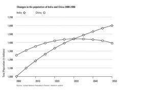
This is a graph about the population of India and China from the year 200 to the present day with projections for growth to the year 2050. The graph shows us the populations as in billions.
The graph starts from the data from 2000. In 2000, India had a population of 1 billion, and China had a population of approximately 1,250 billion. Then the populations of both countries increase. However, the rate of increase in China’s population is lower than the rate of increase in India’s population. For that reason, it can be said that the graph of India has a higher gradient, and as the years increase, the increase rate of the graph of China decreases.
Nevertheless, the situations described in paragraph 2 can only be said in years between 2000 – 2030. In 2030, the populations of both countries become the same, which is approximately 1,450 billion. And after these point India’s population is greater than China’s population. From 2030 to 2050, population of India continues to increase, but population of China starts to decline, and this causes China’s graph with a parabolic shape.

